Roomi: A UX Case Study
Introduction
Many young Americans rent their first apartments or homes once they have some financial stability, and many of those young Americans tend to rent those homes alongside roommates or partners. With renting or even owning a home comes a list of monthly bills and expenses that need to be paid off. These monthly expenses can become a source of great anxiety for many young people when they are first living on their own, and tracking the monthly expenses to pay them off in time can be a challenge for some. This was why for my case study, I wanted to explore how might we better track and budget for shared expenses with housemates? For this pursuit, I was mainly on my own with some advice given to me by my UX mentor. My pursuit of that question is what led me to the creation of Roomi, a mobile application that tracks and reminds roommates of shared expenses.
Secondary Research
One of the first bits of information that helped me to decide to pursue the shared expense question, was secondary research that I discovered from the US Census Bureau, as they estimate, “renters headed about 36% of the nation’s 122.8 million households in 2019” a percentage I theorized had increased in the economic downturn of 2020. What’s further, a chief demographic amongst those renters were in fact young Americans.


I also performed a Heuristic Analysis of 2 direct competitors Splitwise (pictured left), Tricount (center), and an indirection competitor Venmo (right) some highlights include:
Pros found from analysis:
All were easy for the user to set up expenses, or send requests for expenses in Venmo’s case
Tricount has a reminder system for unpaid expenses on app.
Splitwise can list all expenses on a single page and direct users to Venmo for payment.
Cons found from analysis:
Venmo has a reminder system but an expense has to be sent and reset up when paid.
Splitwise holds some premium content and features behind a paywall and access to personal data.
Tricount has very busy UI and offers little direction for using the application.
Primary Research:
The real meat of my research which I felt helped shape the direction of Roomi came from the user surveys and interviews. I had sent out a questionnaire over various social media sites such as Discord, Facebook, and Twitter in order to gauge my user base as well as ideal candidates for interviews; images from that survey are in the image below, but some notes from the survey were:
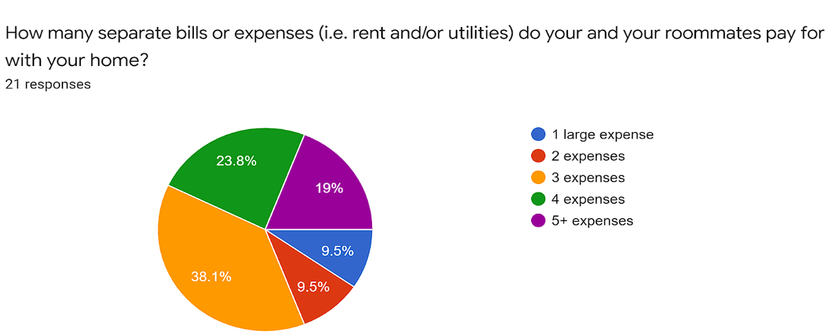
Almost 81% stated they at least 3 different expenses to track and pay over a monthly basis
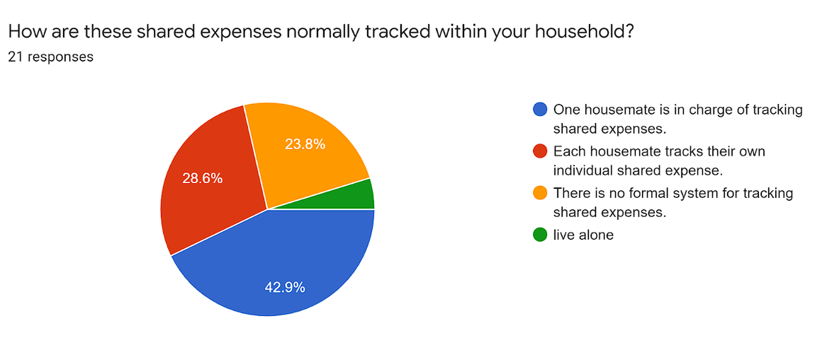
44% leave one roommate in charge of tracking all expenses in a residence
24% have no formal system for tracking expenses.
After going through the data I selected candidates for interviews and received some interesting insights. Some of those insights included:
Multiple lates payments from one roommate in a 4-person residence having to track everything at once and being overwhelmed costed an interviewee more money over time and was the cause of a lot of financial anxiety for all 4 roommates.
One interviewee experienced great frustration as his roommate who handles all house expenses refuses to explain to him the tracking process.
Multiple interviewees use an excel sheet to track expenses, due dates, and who is in charge.
Multiple interviewees resolve most conflict in the residence by having a physical copy of the bill present with them.
Multiple users wanted a more automated and transparent system for all residents.
For my Affinity Map, I noted down the details of my interview that stuck out to me. I kept note of the number of roommates each interviewee had, the number of expenses they paid for, any tracking methods they used for the shared expenses, as well as some general thoughts they had about their current system. For example, I had mentioned previously that one interviewee had expressed frustration with not knowing how his roommate tracked both of their shared expenses. The interviewee also expressed that he wanted and thought that perhaps there was a more automated system for tracking expenses. I separated out the details as to how that interviewee’s expenses were tracked into one area of the affinity map explaining that the roommate handles everything, I then put the frustrations and wants for this interviewee into separate parts of the map as well. See below for the full map and my persona for Roomi.
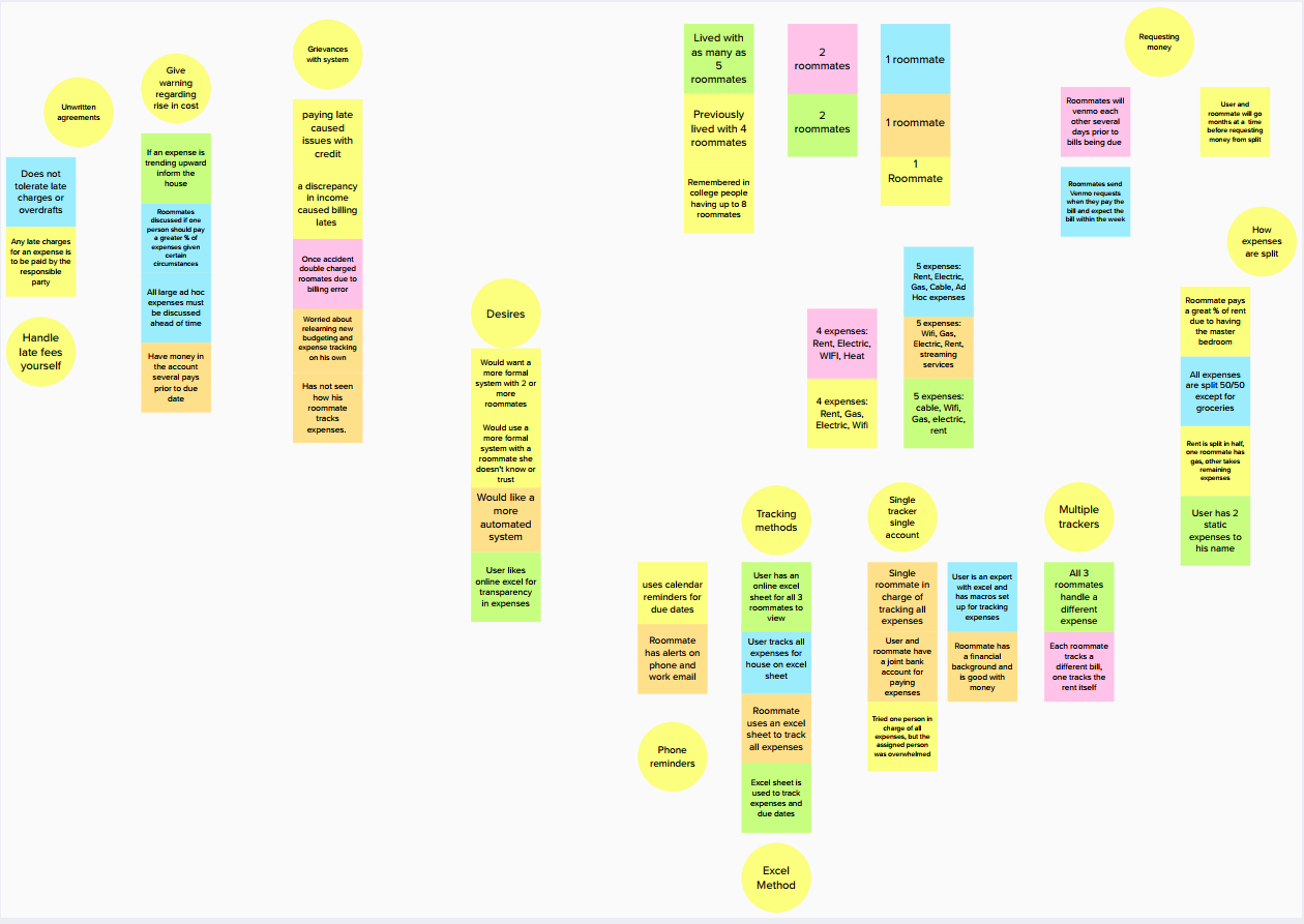
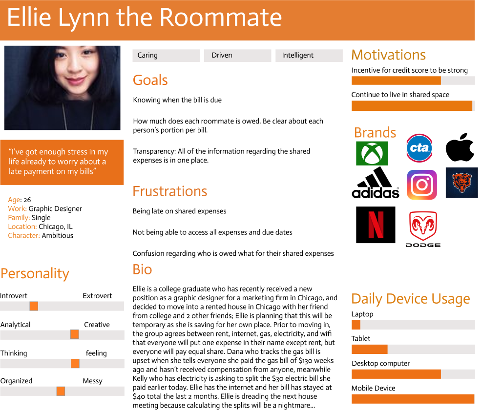
All of this mind helped me to create the Persona for Roomi. The persona is Ellie Lynn, a 26-year-old graphic designer from Chicago. Ellie Lynn lives with 3 roommates and gets frustrated when bills are due and the ensuing confusion as to who was late on their bill and how much is owed to each individual roommate upon the bill getting paid. These frustrations coincide with Ellie Lynn’s ambition to eventually buy a place of her own, in which she would need a good credit score and enough funds to work towards that future. I also included an Affinity Map that helped to guide my decisions.
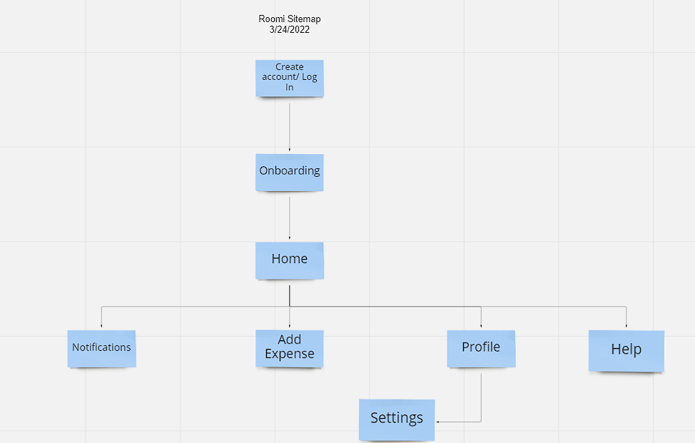
Information Architecture
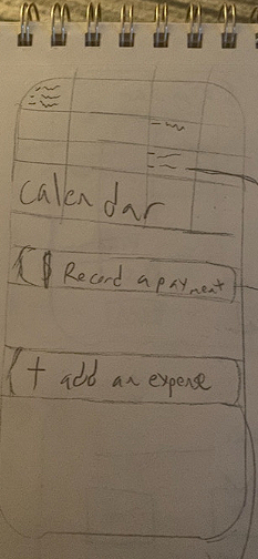
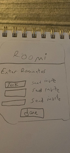
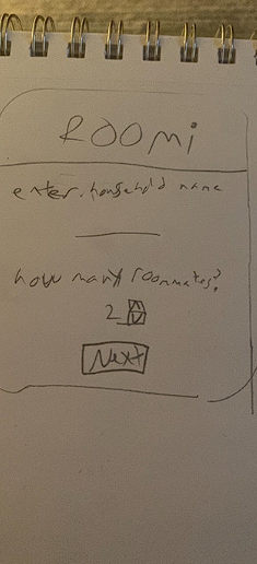
Once I had compiled my research I got to work on building a site map. In order to keep the process straightforward and transparent, I opted for a simpler function as I designed the sitemap, which included a homepage that would feature a calendar for expenses, a separate tab for adding new expenses, as well as the help screen and profile page for the user. This philosophy of straightforward and simple also dictated the userflow in which I designed everything to be straightforward from the registration, as to when the user’s roommates would receive the notification that an expense was paid and their split of the expense. I ultimately was happy with the results and felt that the easy and functional flow of Roomi would be appreciated by users when using Roomi for such a stressful venture of tracking expenses.
Sketches and Guerilla Testing
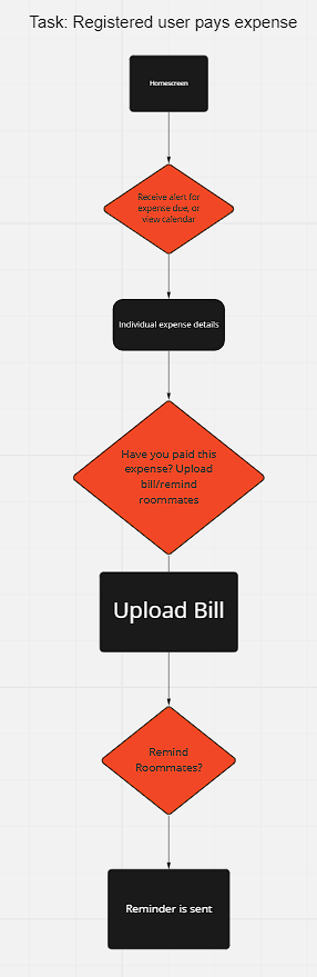
Following this, I began to sketch out an idea for Roomi’s user flow on a sketch pad. As luck would have it I was invited to a March Madness viewing party, so once the sketches were finished I used the Marvel POP app to create a prototype for some Guerilla Usability Testing. I pulled party-goers aside and asked if they could use the app and complete several tasks for me on the app, which included creating an account and paying a bill. Some insights from the testing were:
Users did not like the “Record an expense” button and preferred just use the calendar to find an expense and pay on the individual expense page.
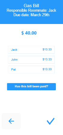
The language of Roomi, particularly the “has this bill been paid?” button could have been clearer.
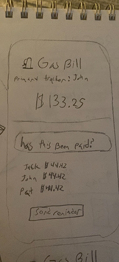
Wireframes
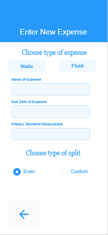
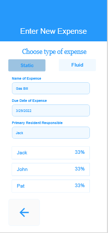
Next came the wireframes in which I used 3 different UX wireframe kits provided by Adobe for their use in Adobe XD. After creating the sign-up process I decided the next step for the user would be to create at least one expense for their house. See below for visual examples of Roomi’s wireframes and follow the full link below to see my full set of wireframes.
Link to full set below
https://xd.adobe.com/view/dda8084e-42e0-48bb-a2cc-ee97d02a1b03-88fb/
Testing the Results:
After giving my wireframes a UI makeover consistent with my style guide for Roomi. I used Invision to create a testing prototype. For creating the prototype, I used my style guide as a reference for upgrading a version of my wireframes to a full app UI for the prototype. The Invision app allows the user to create the prototype along with full animations and transfers for the testers to get the feeling of a full experience in the app. After upgrading and uploading the screens for my prototype. See the link to the prototype below:
https://williamarmonda993892.invisionapp.com/console/share/37MF85YUQWK
I recruited testers through the use of social media such as Discord and Facebook and was able to quickly find 5 users for a usability test of Roomi.
Some of the following issues I discovered during the initial round of testing were as followed:
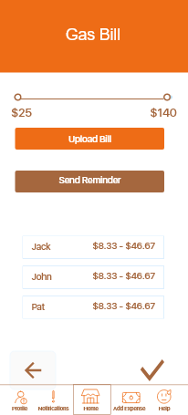
Testers were missing the “Upload Bill” Button entirely, even at times when looking for it
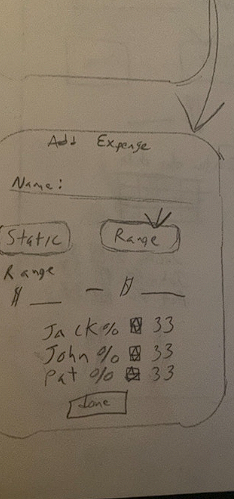
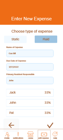
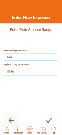
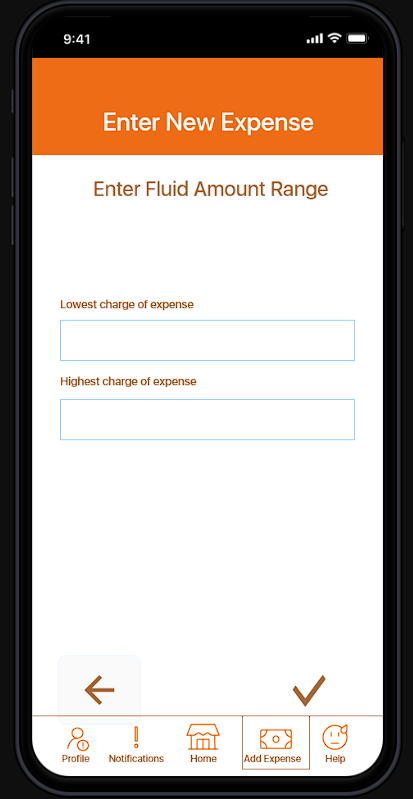
Testers didn’t know where to enter the least expensive to most expensive costs of shared expenses in the fluid section.
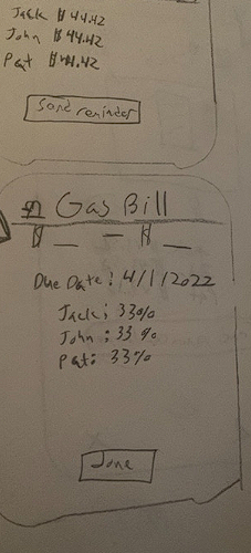
The 2nd round of testing with the iteration of Roomi thankfully didn’t take too long as I had 2 major issues I needed to fix all within the same sequence. To fix the confusion regarding where to enter the amount for the lowest amount of expenses, I added a text box above each text space saying “Lowest Charge of expense” and “highest charge of expense” to signal where to enter each expense should be entered. For the “Upload Bill” button, I moved it above the “Has this been Paid?” button, now the send reminder button, and gave the “Upload Bill” button a primary color so the user would recognize uploading the bill as a primary action.
Before:
After:

Conclusion
Roomi will perhaps hold a special place in my heart as an idea I held in my head for years, and then to finally grow from an idea to a springboard to my journey in UX Design. Throughout the process, I learned from the mistakes I made as a newer UX Designer, and ultimately I learned to come up with a product that feels like I can be proud of for the time being. In time, I am certain I will improve and come up with greater products. If I had more time with Roomi, some areas I would like to improve would be to create a better UI, add in history and a feature that calculates the total amount of money a roommate is owed/owes from shared expenses, and most importantly to me improve the accessibility of the Roomi. During this creation I learned to use various techniques and how to properly research in order to learn what users want in a product, and used psychology similar to Gestalt’s Principles in order to create a simple and easy-to-learn application. Over the course of one year, I worked mostly on my own, researching, building, and testing Roomi, and I cannot wait to see what more awaits me in the years to come.